Best indicators for beginners: simple technical indicators
for beginner traders
For a beginner trader, the market often looks like chaos: price jumps
up, then drops sharply. The best indicators for beginners help structure
this picture by turning changing price action into clear visual signals.
They show trend direction and strength, mark overbought or oversold
zones, help assess entry and exit timing, and make it easier to check a
trading idea before a trade. This is especially important for beginners:
instead of relying only on intuition, you get an additional analytical
tool that reduces random decisions and choices made purely on
emotion.
There are many misconceptions around indicators. There is no “magic”
indicator that always predicts price: all of them process historical
quotes and show probable scenarios, not absolute facts. Indicators do
not replace price action and chart reading – they are only a supporting
tool that works together with an understanding of market structure. And
the more indicators you add to a chart, the worse it gets: too many
tools create conflicting signals and reduce clarity in decision-making.
Professionals use the minimum: one tool to identify the trend and one to
confirm the entry.
Important: trading is a high-risk activity, and indicators do not
remove that risk. Signals lag because they are calculated from past
data; on noisy markets they are often false; the same indicator can work
very well in
forex and poorly in cryptocurrencies. Successful trading is built on
three foundations:
- Understanding market structure.
- Proper risk management.
- A consistent strategy, where indicators act as helpers.
If you are a beginner, first learn to read the chart without them,
then add one or two tools and test how they work on a demo account.
Contents
What
Are Trading Indicators and Why Beginners Need Them

Trading indicators are mathematical tools calculated from price,
volume, and/or time history and displayed on a chart as lines, bands,
bars, or colored zones. They help visualize trend, movement strength,
overbought/oversold conditions,
volume,
and market volatility. In this article, we will focus on the best day
trading indicators for beginners and the best forex indicators for
beginners that rely on price, volume and volatility data.
For traders, indicators matter because they simplify analysis,
provide extra entry and exit signals, reduce emotional decisions, and
help structure the market picture. But they do not control the market.
They only process existing data according to specific rules, for
example:
- averaging price over time,
- comparing the current price with past values,
- measuring the difference between highs and lows,
- showing total traded volume,
- assessing trend strength and direction.
For beginner traders, indicators are especially useful because
they:
- Simplify market perception. Instead of analyzing hundreds of bars
and trying to “spot the trend by eye,” you get a clear trend line or
oscillator that immediately shows whether the market is rising, falling,
or moving sideways.
- Provide extra signals. For example, an oscillator can show that
the market is overbought, which is a signal to consider an exit or a
short position. A trend indicator can confirm that the trend is still
strong and that it makes sense to stay in the trade.
- Reduce emotional trading. When you have clear rules like “enter
only if RSI < 30 and price is above the 50-bar MA,” you are less
likely to act on impulse or fear.
- Help test ideas. Before a trade, you can check whether your idea
matches the indicator data, which reduces the number of random
trades.
But it is important to remember: indicators are not “magic.” They do
not predict price; they only show probable scenarios based on the past.
And they work only together with:
- an understanding of market structure (trends, levels,
ranges),
- a proper entry and exit strategy,
- sound risk management.
Main categories
All trading indicators can be divided into four main groups. Each
group provides a different type of market information and helps a trader
notice something important that is not so easy to see on a regular
chart.
Let’s look at the main categories first, and then discuss the key
indicator types and how to use them in more detail later in the text. In
total, there are 4 basic categories.
1. Trend indicators
Trend indicators for beginner traders, such as moving averages and
MACD, help you see whether the market is rising, falling, or moving
sideways without guessing. They also help assess trend strength and
highlight moments when the trend may weaken or reverse.
Examples: Moving Average (MA, SMA, EMA), MACD, ADX (Average
Directional Index).
2. Momentum / oscillators
Oscillators measure the speed and strength of price movement. They
show when the market is overbought or oversold, and can signal a
possible reversal or weakening momentum.
Examples: RSI (Relative Strength Index), Stochastic Oscillator, CCI
(Commodity Channel Index).
3. Volume indicators
They show the number of trades and market participation. Volume helps
determine how strongly a trend is supported by real trading activity,
and it highlights areas where movement may be false or strong.
Examples: standard Volume,
On-Balance Volume (OBV), Volume Profile.
4. Volatility indicators
Volatility indicators measure the price range – how “calm” or
“aggressive” the market is. They are useful for assessing risk and for
placing stop-losses and
take-profits
correctly.
Examples: Bollinger Bands, ATR (Average True Range), Standard
Deviation.
Leading
vs Lagging Indicators: Which Is Better for Beginners
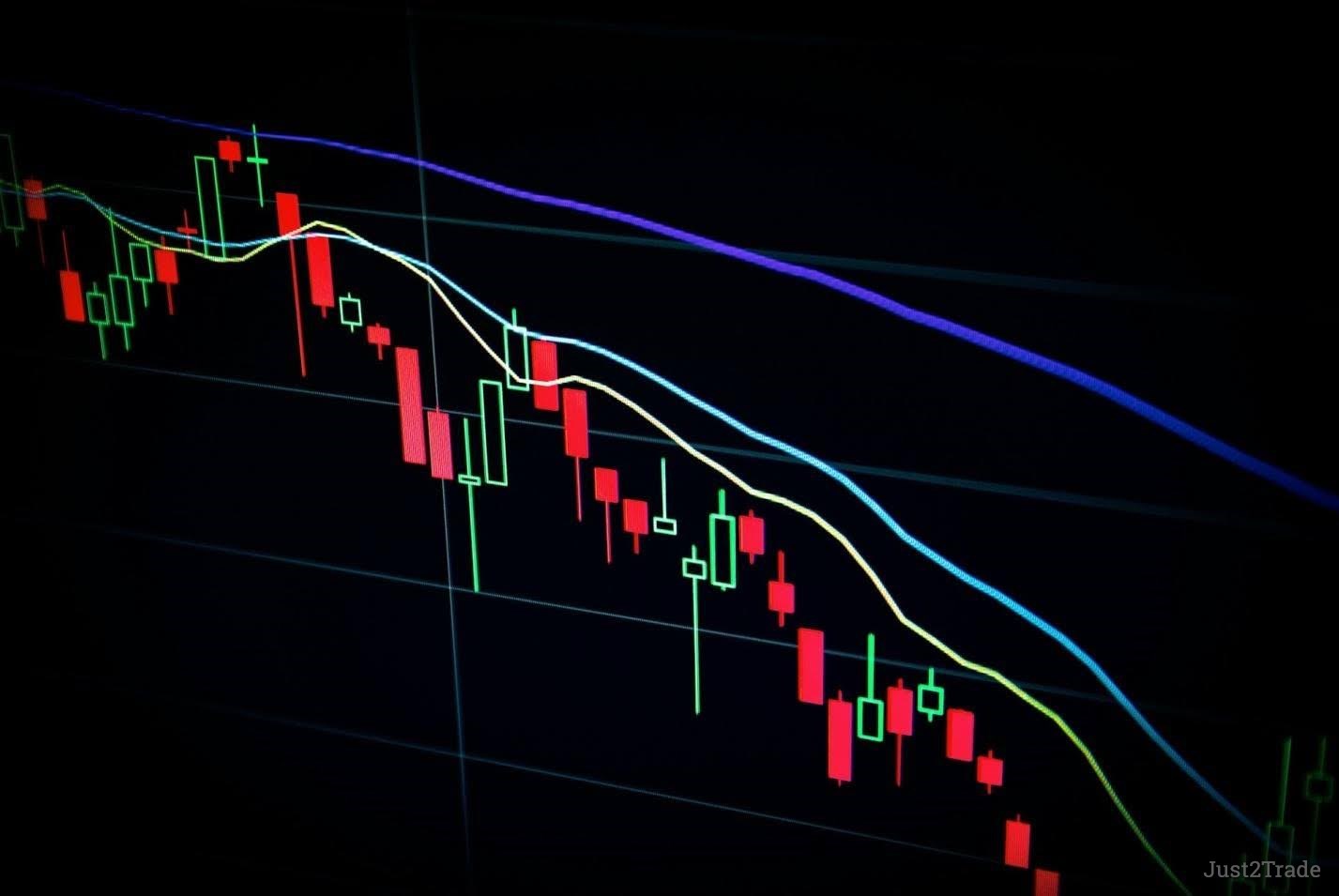
Indicators can also be divided into two types based on when they give
a signal.
1. Leading indicators
These are indicators that give a signal before the price or trend
changes, allowing you to react in time.
They analyze current data and try to “predict” a reversal or
continuation. Most often, these are oscillators. For example: RSI,
Stochastic, CCI, and some versions of Momentum.
Pros:
- Early signals let you enter trades sooner.
- Useful for reversals and range-bound markets.
Cons:
- More false signals.
- They often “predict” a reversal that does not happen.
- They require experience and signal filtering.
For beginners: leading indicators are dangerous if you use them as
the main entry signal. It is better to use them as confirmation together
with price action and trend tools.
2. Lagging indicators
These are indicators that give a signal after the price movement has
already started.
They average past data, so the signal appears with a delay. These are
usually trend indicators. For example: Moving Average (SMA, EMA), MACD,
ADX, ATR, Bollinger Bands.
Pros:
- Fewer false signals.
- Better at confirming the trend.
- Easier for beginners.
Cons:
- The signal comes late, so the entry is later and the potential
profit is smaller.
- During fast reversals, you may miss part of the move.
For beginners: lagging indicators are a good starting point. They are
simpler, more reliable, and make fewer mistakes.
Top Best Trading
Indicators for Beginners
Now, as promised above, let’s move to a detailed breakdown of the
most popular, simple, and useful indicators for beginners. We will also
cover three additional ones for further practical use.
Moving Averages (SMA and EMA)
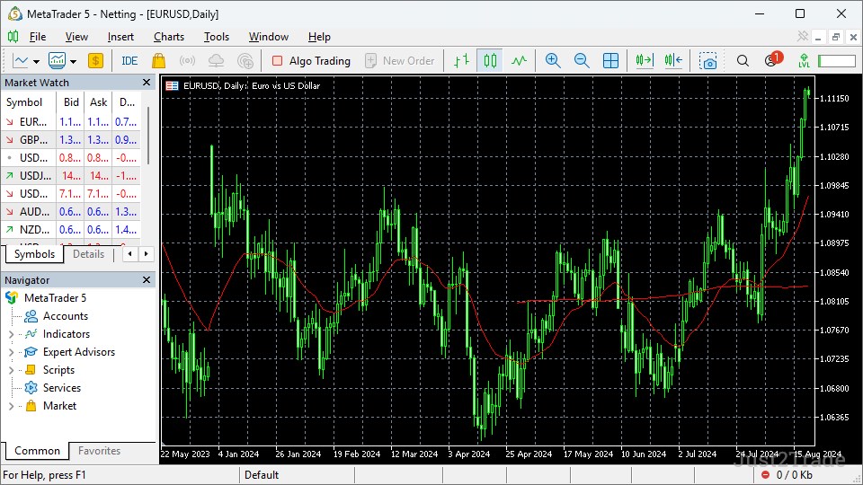
Moving Average (MA) is the average price over N bars. It smooths out
noise and shows trend direction as a line that follows price.
- SMA (Simple Moving Average) is a simple average: all closing
prices over N bars are summed and divided by N.
- EMA (Exponential Moving Average) gives more weight to recent
bars, so it reacts faster to price changes.
Default and recommended
settings
Default: SMA 20, SMA 50, SMA 200; EMA 9, EMA 20, EMA 50.
For beginners:
- EMA 20 for the short-term trend.
- EMA 50 for the medium-term trend.
- SMA 200 for the long-term trend.
How to use
Trend direction:
- If price is above the moving average, the trend is upward, and
you may consider buying.
- If price is below the moving average, the trend is downward, and
you may consider selling.
Moving average crossovers:
- A fast MA, such as EMA 20, crossing above a slower one, such as
EMA 50, is a buy signal.
- A fast MA crossing below a slower one is a sell signal.
Pullback from the moving average:
- In an uptrend, price pulls back, bounces off EMA 20 or EMA 50,
and continues upward. This confirms the trend and offers a possible buy
entry.
- In a downtrend, price pulls up, bounces off the MA, and continues
falling. This is an opportunity to enter a short trade.
Advantages and disadvantages
Pros:
- Simple and easy to understand.
- Shows trend well.
- Gives fewer false signals than oscillators.
Cons:
- A lagging indicator.
- Gives many false crossovers in sideways markets.
- Does not predict reversals, only confirms them later.
Best timeframes
- M15, H1, H4 for intraday and short-term trading.
- D1, W1 for long-term trading and investing.
Real-market examples
- Apple stock (AAPL), April 2020 to December 2020: After the March
2020 panic caused by the start of the pandemic, AAPL formed an uptrend.
EMA 20 crossed above EMA 50 in late April 2020, which was an early
signal of continued recovery. In May and June, price bounced off EMA 20
several times, confirming the strength of the short-term trend, while
SMA 200 remained below price, confirming the long-term bullish bias.
Several major bounces off EMA 20 in August coincided with rising volume,
marking good add-on entries. Later, in November 2020, the fast EMAs
bounced upward again after a brief correction, offering new entries on
breakouts of local highs.
- S&P 500 index, February 2020 to March 2020 (correction and
reaction): At the beginning of 2020, during the sharp market selloff,
SMA 50 crossed below SMA 200 in March 2020, producing the so-called
“death cross,” which served as strong confirmation of downward momentum.
However, after the extreme drop, fast EMAs (9 and 20) began to move
quickly toward price, and in late March 2020 EMA 9 crossed above EMA 20
– a signal of a local reversal and the start of recovery. This case
shows that moving averages work well together with volume analysis and
market context: the long-term death cross confirmed risk, while the fast
EMAs provided tactical bounce-entry signals.
From these examples, we can draw the following conclusions:
- Combining different periods – fast EMAs for precise entries and
SMA 200 for trend filtering – helps separate tactical signals from false
ones.
- Moving average crossovers work well in trending conditions, but
they produce many false signals in flat markets, so it is useful to
watch volume and confirmation from higher timeframes.
- During periods of high volatility, fast EMAs work better for
short-term entries, but the risk of false breakouts increases, so it is
important to use stops and calculate risk/reward.
RSI (Relative Strength Index)
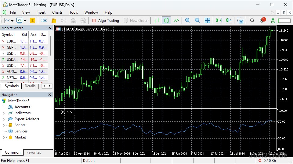
RSI is an oscillator that compares average gains and average losses
over N bars, usually 14. It shows how overbought or oversold the market
is.
- RSI moves between 0 and 100.
- High values mean overbought conditions.
- Low values mean oversold conditions.
Default and recommended
settings
Default: period 14, levels 70 and 30.
For beginners:
- Period 14 as standard.
- Levels 70 for overbought and 30 for oversold.
- You can also add the 50 level as the trend center.
How to use
Overbought and oversold:
- If RSI is above 70, the market is overbought and a downward
reversal may be possible. This is a potential sell signal.
- If RSI is below 30, the market is oversold and an upward reversal
may be possible. This is a potential buy signal.
Divergence:
- Price makes a new high, but RSI does not make a new high – this
is bullish divergence and a buy signal.
- Price makes a new low, but RSI does not make a new low – this is
bearish divergence and a sell signal.
Crossing 50:
- If RSI moves above 50, upward momentum is strengthening and there
is buying potential.
- If RSI moves below 50, downward momentum is strengthening and
there is selling potential.
Advantages and
disadvantages
Pros:
- Clearly shows overbought and oversold conditions.
- Works well in sideways markets.
- Divergence is a strong reversal signal.
Cons:
- In a strong trend, it can remain overbought or oversold for a
long time without reversing.
- It is a leading indicator, so it gives more false
signals.
- It needs filtering through trend and price action.
Best timeframes
- H1, H4, D1 for short-term and medium-term trading.
- M1–M5 is noisy, and RSI often gives false signals.
Real-market examples
- Overbought in a strong uptrend: Imagine a large tech stock that
rises for several days after a positive earnings report without a
serious pullback. On H4, RSI with a 14-period setting moves above 70 and
stays in the 70–80 zone while price keeps making new highs. Many
beginners sell simply because RSI is above 70, but price may still make
one or two more upward impulses, stopping out those shorts. This example
shows that in a strong trend RSI can stay overbought for a long time, so
it is better used as a filter rather than as a standalone countertrend
entry signal.
- Oversold and bounce: Now take a currency pair that has been
falling for several days on negative news. On H1, RSI drops below 30 and
reaches values around 20–25 while price makes new local lows. After some
time, a candle with a long lower wick appears, and RSI turns upward and
exits the oversold zone. This is a classic scenario: oversold RSI, signs
of buying interest in candlestick analysis, and weakening selling volume
create a point for an aggressive long entry with a tight stop below the
low.
- Divergence as a reversal signal: A typical stock index situation
is when, on the daily chart, price makes a new high compared with the
previous peak, but RSI shows a lower peak than before. On the chart,
this appears as a higher high in price and a lower high in the indicator
– a classic bearish divergence. A few days later, the index breaks the
nearest support, RSI falls below 50, and a correction begins. Here,
divergence warned of weakness in advance, while the support break and
RSI move below 50 confirmed the reversal.
Conclusions from the examples:
- In a trend, RSI should not be read literally as “above 70 = sell
immediately”; it is better used to spot momentum exhaustion and exit
points, while entries should follow the trend.
- Levels 30 and 70 work well in sideways markets, where the market
regularly reverses from the edges of the range; there RSI helps catch
extremes and trade pullbacks.
- RSI divergence becomes especially strong when it is confirmed by
level breaks, changes in high/low structure, and a move through the 50
zone in the direction of the new move.
MACD (Moving Average
Convergence Divergence)
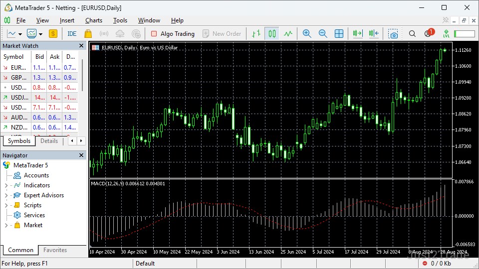
MACD is a
trend momentum indicator that shows the difference between two
exponential moving averages, usually 12 and 26.
- MACD line – the difference between EMA 12 and EMA 26.
- Signal line – a 9-period EMA of the MACD line.
- Histogram (MACD histogram) – the difference between the MACD line
and the Signal line.
The indicator shows trend direction, trend strength, and the moments
when the lines cross.
Default and recommended
settings
Default: 12, 26, 9.
For beginners: keep the standard 12/26/9.
Later, you can experiment with longer periods, for example 24/52/18,
for longer-term trading.
How to use
Line crossovers:
- MACD line crossing above the Signal line is a buy
signal.
- MACD line crossing below the Signal line is a sell
signal.
Position relative to zero:
- If MACD is above 0, the trend is upward.
- If MACD is below 0, the trend is downward.
Divergence:
- Price makes a new high, but MACD does not – this is bullish
divergence and a potential buy.
- Price makes a new low, but MACD does not – this is bearish
divergence and a potential sell.
Histogram:
- If the Histogram is rising, upward momentum is
strengthening.
- If the Histogram is falling, downward momentum is
strengthening.
Advantages and
disadvantages
Pros:
- Shows trend direction and strength.
- Gives clear crossover signals.
- Divergence is a strong reversal signal.
Cons:
- A lagging indicator.
- Produces many false crossovers in sideways markets.
- Not suitable for very fast M1–M5 entries without
filtering.
Best timeframes
- H1, H4, D1 for short-term and medium-term trading.
- M1–M5 is noisy, and signals are often false.
Real-market examples
- MACD crossover with the trend: Imagine a stock that, after a
sideways period, starts forming a series of higher highs and higher lows
on H4. After a breakout above an important resistance level, the MACD
line moves above zero, and soon crosses the Signal line from below to
above, while the Histogram moves from negative to positive and starts
rising. This is a classic signal: the trend has already reversed, price
has held above the level, and MACD confirms the strengthening bullish
momentum. In such a situation, it makes more sense to look for long
entries on pullbacks rather than trying to short against the new
trend.
- Weakening momentum in the Histogram: Suppose a currency pair has
been rising for a long time on a strong fundamental driver. Price keeps
making higher highs, but on the daily chart the MACD Histogram bars are
getting smaller: each new peak is lower than the previous one, even
though the MACD line is still above zero. This signals that momentum is
fading: the trend still exists formally, but the strength of the move is
decreasing. Often after this kind of setup, the market moves into a
sideways phase or a deeper correction, so this is a good place to lock
in part of the profit and tighten stops rather than open new
longs.
- MACD divergence and reversal: A typical situation for an index or
commodity market. Price makes a new local low during panic, but on MACD
the low is higher than the previous one: the MACD line and Histogram are
no longer making new extremes, despite the lower price. This is bearish
divergence in the context of a down move, showing that sellers are
weakening. After that, a reversal candlestick pattern appears on the
chart, price returns above the local support
level, and the MACD line crosses the Signal line upward and starts
moving toward zero. In this setup, divergence acts as an early warning,
while the crossover and MACD’s move toward zero confirm the shift from
decline to correction or a new rise.
Conclusions from the examples:
- The MACD line and Signal line crossover is most reliable when it
matches an already formed price structure, such as a series of
highs/lows, and a breakout of levels.
- The Histogram is useful not only as a supplement but also as a
momentum-decay indicator: shrinking bars often warn of an approaching
correction or flat range.
- MACD divergence has more weight on higher timeframes (H4, D1),
especially if it is confirmed by a change in market structure and MACD
moving out of an extreme zone toward zero.
Bollinger Bands
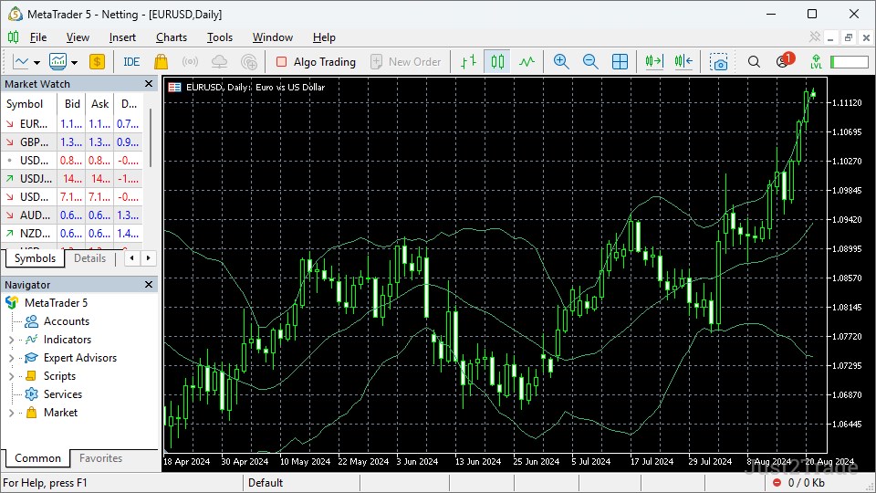
Bollinger Bands explained for beginners show how volatility expands
and contracts, helping traders place stop-losses and take-profits more
accurately. Bollinger Bands made up of three lines:
- Middle band – usually SMA 20.
- Upper band – the average plus N standard deviations, usually
2.
- Lower band – the average minus N standard deviations.
The bands expand during high volatility and contract during low
volatility. Price often moves between the upper and lower bands.
Default and recommended
settings
Default: period 20, deviation 2.
For beginners: keep 20/2.
Later, you can try deviation 2.5 for stricter zones.
How to use
Band bounces:
- Price rises to the upper band and bounces down – a potential sell
in a downtrend or range.
- Price falls to the lower band and bounces up – a potential buy in
an uptrend or range.
Band breakouts:
- Price moves sharply above the upper band – possible breakout to
the upside and a strong impulse.
- Price moves sharply below the lower band – possible breakout to
the downside.
Band squeeze:
- Bands become very narrow – this is low volatility, often followed
by a strong breakout.
Walk the bands:
- In a strong trend, price “walks” along the upper band in an
uptrend or the lower band in a downtrend – this confirms the
trend.
Advantages and
disadvantages
Pros:
- Shows volatility visually.
- Works well in ranges, where price bounces from the
bands.
- Helps assess risk and place stops.
Cons:
- Does not give a clear trend direction.
- During strong breakouts, price can push through the band and keep
going, which creates false bounce signals.
- Requires understanding of market structure.
Best timeframes
- M15, H1, H4 for intraday and short-term trading.
- D1 for medium-term and long-term trading.
Historical example
Before the market crash in February 2020, Bollinger Bands on the
daily S&P 500 chart were noticeably squeezed: volatility was low,
price was slowly making new highs, and the upper and lower bands were
close to the middle line. When news about the spread of COVID-19 and the
first restrictions began, the index broke sharply below the lower band:
candles became larger, closes were printed below the lower boundary, and
the bands began to expand rapidly. This was a classic scenario: the
squeeze phase changed into an explosive rise in volatility and a
powerful downside breakout, during which price for some time literally
“walked” along the lower band, confirming the strength of the downtrend
and warning that early attempts to catch a bounce against the move
carried high risk.
After the first wave of selling, in late March 2020, the same daily
chart began to show candles with long lower wicks that moved below the
lower band but closed closer to the middle band. Bollinger Bands
remained wide, but price no longer stayed firmly at the lower boundary
and started to return inside the channel. This combination – an extreme
move below the lower band, then a return inside the bands and a gradual
narrowing of the range – was an early sign that the panic selloff was
fading, volatility was starting to decline, and the market was preparing
for a stabilization phase and further recovery.
Conclusions from the example:
- Strong band compression on higher timeframes often comes before a
powerful move; by itself it is not a direction signal, but it is a good
early marker of an upcoming expansion.
- In a trending move, a band breakout and a “walk the bands” regime
show impulse strength, so it is dangerous to automatically trade against
the trend just because price moved outside the band.
- A return inside the bands after an extreme move, together with a
gradual narrowing of the range, often signals the end of a panic phase
and a shift into a calmer market, where reversal or correction scenarios
make more sense.
Volume
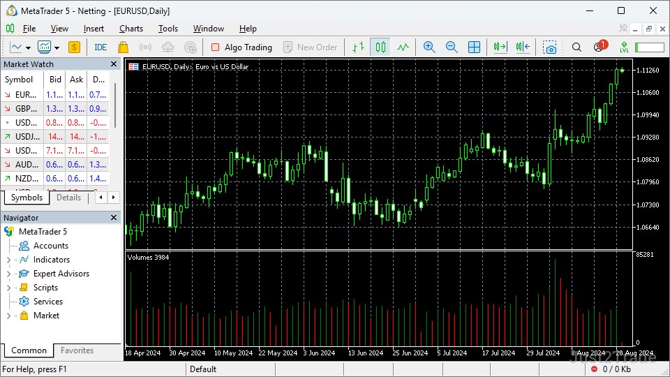
Volume is a simple bar showing the number of contracts or lots per
bar.
- High volume means high activity.
- Low volume means low activity.
The indicator has two additional versions:
- VWAP
(Volume Weighted Average Price) is the average price weighted by volume.
It shows the “market price” taking participant activity into
account.
- OBV (On-Balance Volume) accumulates volume according to price
direction and shows whether the trend is supported by volume.
Default and recommended
settings
- Volume: no settings, just a bar.
- VWAP: usually calculated from the start of the session (day,
week), with minimal settings.
- OBV: default periods, usually 14; for beginners, keep the
standard.
How to use
Volume on breakout:
- A level breakout with high volume is a strong breakout and has a
high probability of continuation.
- A level breakout with low volume is a false breakout and has a
high probability of price returning.
Volume in trend:
- Uptrend with rising volume – the trend is supported by
volume.
- Uptrend with falling volume – the trend is weak, and a reversal
may be possible.
VWAP:
- Price above VWAP – buyers are in control, and this is a potential
buy.
- Price below VWAP – sellers are in control, and this is a
potential sell.
OBV:
- OBV rises together with price – the trend is supported by
volume.
- OBV falls while price rises – the trend is weak, and a trap may
be forming.
Advantages and
disadvantages
Pros:
- Shows real participant activity.
- Helps distinguish a strong breakout from a false one.
- VWAP is a good reference for intraday trading.
Cons:
- On some markets, such as forex, true volume is not available, so
only tick volume is used.
- Volume alone does not give direction, only strength.
- It needs filtering through trend and levels.
Best timeframes
- M15, H1, H4 for intraday and short-term trading, especially
VWAP.
- D1 for medium-term and long-term trading, Volume and
OBV.
Real-market examples
- Breakout on stocks: Imagine a large IT company stock that has
traded sideways for several months, forming solid resistance at the same
level. On the day a strong earnings report is released, price breaks
above that resistance, and the volume bar is several times higher than
the average over the previous weeks. Such a breakout, supported by
unusually high volume, often leads to continuation: after a short
consolidation above the old resistance level, which then turns into
support, price makes another upward impulse, confirming that the
breakout involved strong buying rather than a random spike.
- VWAP as an intraday
“magnet”: On a stock index futures contract, price after the open makes
a sharp upward impulse on news, moving noticeably away from VWAP. After
some time, the move fades, reversal candles appear, and buying volume
decreases. In many such situations, price starts to return to VWAP,
which acts like a magnet: by mid-session the instrument is trading near
the VWAP line, and many intraday traders take profit right at or after
touching that average. For intraday trading, this is a typical scenario:
a strong deviation from VWAP plus weakening trend volume creates an idea
for a countertrend trade with a target near VWAP.
- OBV example – a “empty” rise: Imagine a stock that rises slowly
over several weeks, but volume bars are shrinking, and the OBV line
first moves sideways and then even begins to decline slightly. Price
makes new local highs, but OBV does not confirm them: the indicator
shows that volume is weak on up days and larger trades are occurring on
red days. Such a divergence between price and OBV often comes before a
reversal: after the last push up on low volume, a sharp bearish candle
appears on higher volume, and price quickly falls back below the
previous level. This is a classic trap for late buyers, when the rise
was not supported by real money.
Conclusions from the examples:
- A strong breakout of a level is almost always accompanied by
above-average volume; a breakout on “empty” volume is much more likely
to be false and often returns back under the level.
- In intraday trading, VWAP is useful as a reference for the
session’s “fair price”: a deviation from it, combined with weakening
trend volume, often leads to a return.
- OBV helps distinguish a healthy trend from an “empty” move: if
price goes one way and OBV goes the other, it is better to be cautious
and not chase price without volume confirmation.
Stochastic Oscillator
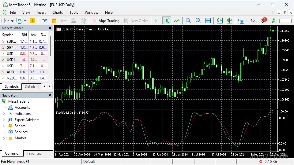
Stochastic
is an oscillator that compares the current closing price with the price
range over N bars, usually 14.
- It consists of two lines: %K, the fast line, and %D, the slow
line.
- It moves between 0 and 100.
- High values mean overbought conditions.
- Low values mean oversold conditions.
Default and recommended
settings
Default: 14, 3, 3 (the %K period, %K smoothing, %D smoothing). For
beginners: keep 14/3/3.
Later, you can try longer periods, such as 21/3/3, for less noisy
signals.
How to use
Overbought and oversold:
- If %K and %D are above 80, the market is overbought and this
creates a potential sell setup.
- If %K and %D are below 20, the market is oversold and this
creates a potential buy setup.
Line crossovers:
- %K crossing above %D below 20 is a buy signal.
- %K crossing below %D above 80 is a sell signal.
Divergence:
- Price makes a new high, but Stochastic does not – this is bullish
divergence and a buy setup.
- Price makes a new low, but Stochastic does not – this is bearish
divergence and a sell setup.
Advantages and
disadvantages
Pros:
- Clear signals in overbought and oversold zones.
- Works well in ranges.
- Simple and easy to understand.
Cons:
- It is a leading indicator, so it gives many false signals in
strong trends.
- In a strong trend, it can stay above 80 or below 20 for a long
time without reversing.
- It needs filtering through trend and price action.
Best timeframes
- H1, H4, D1 for short-term and medium-term trading.
- M1–M5 is noisy, and signals are often false.
Real-market examples
- Classic oversold bounce: Imagine a stock that has been falling
for several days on H4, forming a series of lower lows. At some point,
Stochastic (14/3/3) moves below 20, and both %K and %D stay stuck in the
oversold zone. After a candle with a long lower wick forms, %K turns
upward and crosses %D from below, while still remaining below 20. This
is a typical aggressive entry scenario: oversold conditions plus a
reversal crossover at the bottom of the range. Often after such a
signal, price gives at least a technical bounce toward the nearest
resistance or moving average, where it makes sense to take partial
profit.
- Overbought and “stuck” in a trend: Now take a currency pair that
forms a strong uptrend on H1 due to major news. Stochastic regularly
moves above 80 and may stay in the overbought zone for several bars
while price keeps making new highs. Beginners often try to short every
“%K crossed below %D above 80” signal and get caught in further upside.
This example shows that in a strong trend, Stochastic is better used as
a filter – not to open new longs at the highs – while entries should
still follow the trend, for example after a pullback, when the indicator
exits the overbought zone and turns up again.
- Divergence as an early reversal signal: A typical daily-chart
situation for a stock is when price makes a new high versus the previous
peak, but Stochastic prints a lower high than before. Visually, price
shows a higher high while Stochastic shows a lower high, forming bearish
divergence. A few days later, the market breaks local support,
Stochastic drops below 80 and then quickly falls toward 50 and lower. In
this case, divergence warned of buyer weakness in advance, while the
level break and the indicator’s move down already confirmed the start of
a correction.
Conclusions from the examples:
- In a range, Stochastic works well with the 20/80 zones: bounces
from oversold and overbought conditions often produce clear moves toward
the range edges.
- In a trend, you should not trade Stochastic directly against the
move: overbought and oversold conditions are more likely to show
momentum strength than an immediate reversal.
- Stochastic divergence becomes stronger when it is confirmed by
level breaks and changes in high/low structure; then the indicator helps
you enter the beginning of a new wave rather than a random
pullback.
Additional Indicators
Once you get comfortable with the main indicators, you can try
additional ones. They are less popular and a bit more complex to use,
but they also have their own advantages and, as a result, their own
followers.
Fibonacci
Fibonacci
is not a classic indicator, but a graphical tool that lets you plot
levels based on the Fibonacci sequence (0.236, 0.382, 0.5, 0.618, 0.786,
and others).
- The levels show possible support or resistance zones after a
correction.
- Price often bounces from the 0.382, 0.5, and 0.618
levels.
Default and recommended
settings
Standard levels: 0, 0.236, 0.382, 0.5, 0.618, 0.786, 1.
For beginners: keep the standard settings and learn to draw from a
clear low to a high in an uptrend, and from a high to a low in a
downtrend.
How to use
- In an uptrend: draw from the latest clear low to the high and
look for a bounce from 0.382–0.618 for a buy entry.
- In a downtrend: draw from the high to the low and look for a
bounce from the levels for a sell entry.
- The levels often work as take-profit targets.
Pros and cons
Pros:
- Works well on many markets.
- Levels often become support or resistance.
Cons:
- Requires skill in drawing correctly.
- Does not give clear signals, only zones.
- In ranges, it can produce many false bounces.
Best timeframes
- H1, H4, D1 for short-term and medium-term trading.
Supertrend
Supertrend is a trend indicator that shows trend direction using dots
above or below price:
- Dots below price mean an uptrend – potential buy.
- Dots above price mean a downtrend – potential sell.
The indicator changes color or position when the trend changes.
Default and recommended
settings
- Default: period 10, multiplier 3, depending on the
platform.
- For beginners: keep the standard settings, then later experiment
with period 14 and multiplier 2–3.
How to use
- Dots move below price – buy signal.
- Dots move above price – sell signal.
- In a trend, price “walks” along the Supertrend dots – this
confirms the trend.
Pros and cons
Pros:
- Very simple and visual.
- Shows trend well.
- Few false signals on H1–D1.
Cons:
- A lagging indicator.
- Many false switches in ranges.
- Not suitable for M1–M5 without filtering.
Best timeframes
- H1, H4, D1 for short-term and medium-term trading.
ADX (Average Directional
Index)
ADX is a trend strength indicator, but not a direction indicator.
- ADX above 25 – strong trend.
- ADX below 20 – weak trend or sideways market.
Default and recommended
settings
- Default: period 14.
- For beginners: keep 14.
- Later, you can try 21 for less noisy signals.
How to use
- ADX rising and above 25 – the trend is strengthening and you can
stay in the position.
- ADX falling and below 20 – the trend is weak and it is better not
to use trend-following strategies.
- Combination with MA or MACD:
- MA shows an uptrend and ADX is above 25 – strong uptrend and
potential buy.
- MA shows a downtrend and ADX is above 25 – strong downtrend and
potential sell.
Pros and cons
Pros:
- Clearly shows trend strength.
- Helps avoid trading in a sideways market.
- Simple and easy to understand.
Cons:
- Does not show direction.
- A lagging indicator.
- Does not give direct buy or sell signals.
Best timeframes
- H1, H4, D1 for short-term and medium-term trading.
How to Combine
Trading Indicators Effectively
Let’s look at a few recommendations that often seem non-obvious to
beginner traders.
No more than 2–3 indicators
at once
One of the most common beginner mistakes is loading a chart with a
dozen indicators. This creates the illusion of “full control,” but in
practice it leads to the opposite result: signals conflict, the market
picture gets lost, and decisions are delayed or made under pressure.
Why you should not use more than 2–3 indicators:
- Conflicting signals. A trend indicator may show growth, an
oscillator may show overbought conditions, and a volume indicator may
show declining activity. A beginner does not know which one to trust and
starts trading randomly.
- Excessive complexity. Each indicator requires understanding,
settings, and filtering. When there are too many, you do not have time
to understand what each signal means, lose focus, and miss the best
entry or exit moment.
- Delayed decisions. The more indicators you use, the longer you
wait for all signals to match. As a result, the entry comes too late,
the stop-loss has to be placed closer, and risk is higher.
- Psychological pressure. A chart full of lines, bands, and bars
creates tension. You start doubting every trade, fearing that you will
“miss the signal,” and this leads to emotional trading.
For beginners, it is better to use the standard minimum:
- 1 trend indicator, such as EMA,
- 1 oscillator, such as RSI,
- 1 volume tool, such as Volume or VWAP.
This is enough to see the basic market parameters: trend,
overbought/oversold conditions, and movement strength.
Best combinations for
beginners
Some indicator combinations work especially well for beginners
because they are simple, clear, and give straightforward signals when
filtered properly. Let’s look at 4 basic examples in more detail.
EMA + RSI + Volume – the
main combination
What it shows:
- EMA – trend direction.
- RSI – overbought/oversold conditions.
- Volume – movement strength.
How to use it:
- If price is above EMA 20/50, the trend is up.
- If RSI is below 30, the market is oversold – this is a buy signal
in an uptrend.
- If volume is high at that level, the breakout or reversal is
supported by volume, which makes the signal more reliable.
Example:
- Price is above EMA 20, so the trend is up.
- RSI drops to 28, which shows oversold conditions.
- High volume appears at this level, and price bounces upward. This
is a good moment to enter a buy.
EMA + MACD – for trend trading
What it shows:
- EMA – trend direction.
- MACD – trend strength and the moment of trend change.
How to use it:
- If price is above EMA 50, the trend is up.
- If the MACD line crosses above the Signal line and MACD is above
0, this confirms the trend and gives a buy signal.
- If MACD starts to fall and moves closer to 0, the trend is
weakening – you should prepare to exit.
This combination works especially well on timeframes
H1, H4, and D1.
Bollinger Bands +
RSI – for ranges and reversals
What it shows:
- Bollinger Bands – volatility and zones.
- RSI – overbought/oversold conditions.
How to use it:
- If price reaches the lower Bollinger Band and RSI is below 30,
this is a potential buy.
- If price reaches the upper band and RSI is above 70, this is a
potential sell.
- If the bands contract and then price breaks out sharply, prepare
for a strong breakout.
This combination works well on M15, H1, and H4.
EMA
+ Volume + ADX – for trend trading with strength confirmation
What it shows:
- EMA – trend direction.
- Volume – activity.
- ADX – trend strength.
How to use it:
- If price is above EMA 50, the trend is up.
- If ADX is above 25, the trend is strong.
- If volume is rising at that level, the trend is supported by
volume.
- If ADX is below 20, the trend is weak – it is better not to enter
trend-following strategies.
Confluence (signal overlap)
Confluence deserves special attention – it is a situation where
several independent factors point to the same scenario. In trading, this
means that not just one indicator gives a signal, but several tools and
elements of market structure confirm it.
Example of confluence:
- Price is above EMA 20 and EMA 50, so the trend is up.
- RSI drops to 28, which signals oversold conditions.
- At that level, price bounces from a key support level.
- High volume appears at the level.
All these factors together – EMA, RSI, support level, and volume –
point to one scenario: a higher probability of an upward reversal within
the trend. This is confluence, and such a signal is more reliable than
if only one indicator were used.
Why confluence matters for beginners:
- It reduces the number of false signals. One indicator can
“mislead” you, but when several indicators give similar signals at the
same time, the chance of error is much lower.
- It increases confidence in the trade. When several tools point in
the same direction, you hesitate less and are less likely to change your
mind.
- It helps you choose better entry points. Confluence often appears
at key levels where price really changes direction.
How to find confluence:
- Use 2–3 indicators from different categories: trend + oscillator
+ volume.
- Add structural elements: support and resistance levels, trend
lines, chart patterns.
- Before entering a trade, check how many factors point to the same
scenario. If there are 3 or more, the signal is reliable.
Common Mistakes
Beginners Make with Indicators
Along with the recommendations, it is also worth looking at several
typical mistakes made by beginner traders.
Overloading the chart
One of the most common beginner mistakes is loading the chart with a
dozen indicators. This creates the illusion of “full analysis,” but in
practice it leads to the opposite result: signals become conflicting,
the market picture is lost, and decisions are delayed or made under
emotional pressure.
We already covered this above, so there is no need to go into it in
detail here. But it was still worth mentioning again because of how
common it is.
Ignoring price action and
volume
Another serious mistake is relying only on indicators and ignoring
market structure: support and resistance levels, trend lines, breakouts
and bounces, as well as volume.
Why this is dangerous:
- Indicators do not predict the future. They process historical
data and show probable scenarios, but they do not replace an
understanding of chart structure.
- Without price action, indicators give false signals. For example,
RSI may show overbought conditions, but in a strong trend price keeps
rising. Without understanding the trend, you may enter a sell too
early.
- Without volume, you cannot judge the strength of the move. A
breakout of a level on low volume is often false, while a breakout on
high volume is stronger. If you do not watch volume, you may enter a
false breakout and lose money.
It is important to remember that indicators are an effective tool,
but still only a supporting one, not the foundation of trading. A truly
successful strategy is always built on:
- an understanding of market structure (price action),
- the proper use of indicators as confirmation,
- volume control to assess movement strength.
Relying on one indicator
Using only one indicator is a classic mistake, especially for
beginners who want a “simple entry button.”
Why this is dangerous:
- One indicator does not give the full picture. A trend indicator
shows direction, but not strength; an oscillator shows overbought
conditions, but not trend; volume shows activity, but not
direction.
- More false signals. One tool is more likely to “mislead” you than
several tools working together.
- No confluence. If only one indicator points to a scenario, the
signal is less reliable. When several factors confirm the same
direction, confidence is higher.
Lack of testing
One of the most critical mistakes is starting to trade real money
without first testing the strategy and indicator settings.
Why this is dangerous:
- Indicators do not work the same on all markets. The same RSI may
work very well in
forex and poorly in cryptocurrencies. A setting that works well
on one timeframe may be ineffective on another.
- Risks are unknown. Without testing, you do not know how many
false signals the strategy produces, what the average loss and profit
are, or how often it blows up.
- Emotional decisions. When you have not tested the strategy, the
first losses create panic, you change the settings, throw out
indicators, and start trading chaotically.
How to test properly:
- Demo
account. It is recommended to test a new strategy on a demo
account for at least 2–4 weeks to see the real picture.
- Backtest. Review the history: how did the strategy perform on
past data? How many winning and losing trades were there?
- Record the settings. Write down indicator settings, entry and
exit rules, and risk size. Do not keep changing them.
- Assess risk. Determine the average loss, average profit, win
rate, and maximum losing streak.
Testing is a mandatory step before real trading. Without it, you do
not know whether the strategy works, and you risk losing money on random
and unproven decisions.
3 Best Practices and Tips
for Beginners
Start with a demo
account or simulator
The first and most important step for a beginner is to start trading
on a demo account or simulator, not with real money. This gives you the
ability to:
- Test your strategy without risk. You can test indicator settings,
entry and exit rules, and not worry about losing money.
- Understand how the market works. On a demo account, you can see
how price moves, how it reacts to levels, and how indicators behave in a
real situation.
- Build habits. You learn to wait for signals, avoid entering on
impulse, place a stop-loss
and a take-profit,
and follow the rules.
- Assess risk. You can see how many false signals the strategy
produces, what the average loss and profit are, and how often losing
streaks happen.
Start with a demo account for at least 2–4 weeks, and preferably for
1–3 months. Real-money trading should begin only after you show stable
results on demo.
Trading journal

The second key rule is to keep a trading journal. This is a record of
all your trades: entry, exit, reason for entry, indicator settings,
result, emotions, and mistakes.
Why the journal matters:
- You see your mistakes. Without records, you remember only the
winning trades and “forget” the losses. A journal shows the real
picture.
- You improve your strategy. By writing down the reasons for entry
and exit, you understand which rules work and which ones need to be
changed.
- You control emotions. When you record your emotions after a trade
– panic, confidence, regret – you start to see how they affect your
decisions.
- You track progress. The journal shows how long it takes to become
consistent and which steps help improve results.
How to keep a journal:
- Record: date, timeframe, asset, direction (buy/sell), entry,
exit, position size, stop-loss, take-profit.
- Also note: reason for entry (which indicators, levels,
confluence), result (profit/loss), emotions, mistakes.
- Once a week, review the journal: which trades were successful,
which were unsuccessful, and which mistakes repeat.
- Draw conclusions: which rules to change, which indicators to add
or remove, and which timeframes work best.
The journal is your personal mentor – it shows the real picture and
helps you improve without repeating major mistakes.
Risk management
The third and critically important principle is proper risk
management. Without it, even the best strategy and the right indicators
will not protect you from losing money.
Basic risk management rules:
- Risk per trade. Do not risk more than 1–2% of your account on a
single trade. If your account is $1,000, the maximum risk per trade is
$10–20.
- Stop-loss. Always place a stop-loss before entering. It protects
you from large losses if the market moves against you.
- Take-profit. Define your profit target in advance. Do not hold a
position “until the end” if the target has already been
reached.
- Risk/reward. Try to make potential profit 2–3 times larger than
the risk. For example, if the stop-loss is $10, the take-profit should
be $20–30.
- Losing streaks. If you lose 3–5 trades in a row, take a break,
analyze the journal, and check the strategy. Do not try to win
everything back immediately.
- Account capital. Do not trade with money you are not prepared to
lose. Trading involves risk, and your capital should be “risk capital,”
not life-essential money.
Risk management is your protection against blowing up your account.
Even if the strategy is wrong sometimes, proper risk management
minimizes losses and gives you the chance to learn from both successes
and failures.
FAQ
-
What are the best trading indicators for
beginners?
RSI, MACD and moving averages for beginners are often recommended as
a basic starter set because they are simple, visual and widely available
on every trading platform.
Moving Average (SMA/EMA) for trend.
RSI for overbought/oversold conditions.
MACD for trend direction and strength.
Plus:
lBollinger Bands for volatility.
Volume for activity.
Stochastic as an alternative to RSI.
They give clear signals and are easy to filter.
-
Is there a single “best” trading indicator for
beginners?
No, there is no single “best” indicator. Each indicator shows only
one part of the picture: trend, momentum, volume, or volatility. A
successful strategy is built on a combination of 2–3 indicators from
different categories and an understanding of market structure.
-
How many trading indicators should a beginner use at
once?
A beginner is better off using no more than 2–3 indicators at the
same time: for example, 1 trend indicator (EMA), 1 oscillator (RSI), and
1 volume tool (Volume). This is enough to see the trend,
overbought/oversold conditions, and movement strength without conflicts
or chart overload.
-
What is the difference between leading and lagging
indicators?
Leading indicators give a signal before the price changes, for
example RSI and Stochastic. They can help anticipate market moves, but
they give more false signals. Lagging indicators give a signal after the move has already started,
for example SMA, EMA, and MACD. They lag, but they make fewer mistakes
and confirm the trend better. For beginners, lagging indicators are often more comfortable and
safer.
-
How do Moving Averages (SMA and EMA) work for
beginners?
A Moving Average averages price over N bars and shows the trend as a
line:
SMA is a simple average and reacts more slowly.
EMA is exponential and gives more weight to recent bars, so it
reacts faster.
If price is above the MA, the trend is up; if price is below the MA,
the trend is down. A crossover between a fast and a slow MA gives buy
and sell signals.
-
What is RSI and how do you use it?
RSI (Relative Strength Index) is an oscillator that compares the
average rise and fall of price over N bars, usually 14. It moves from 0
to 100:
RSI > 70 means overbought conditions and a risk of a downward
reversal, potential sell.
RSI < 30 means oversold conditions and a risk of an upward
reversal, potential buy.
It also uses divergence: when price makes a new high but RSI does
not, that is a buy signal.
-
What is MACD and how is it different from RSI?
MACD is a trend momentum indicator that shows the difference between
two EMAs, usually 12 and 26. It gives signals through line crossovers,
position relative to zero, and divergence. RSI is an oscillator for overbought/oversold conditions.>The difference is:
MACD shows trend direction and strength.
RSI shows overbought/oversold conditions.
They work better together than separately.
-
How do Bollinger Bands work and when should beginners use
them?
Bollinger Bands are a volatility indicator made of three lines: the
middle line, usually SMA 20, and two bands at ±2 standard
deviations.
When the bands contract, volatility is low and a breakout often
follows.
When the bands expand, volatility is high.
A bounce from the upper band is a potential sell, and a bounce
from the lower band is a potential buy.
Use them in sideways markets for band bounces and for assessing
risk.
-
How can beginners combine trading indicators
effectively?
A beginner should combine 2–3 indicators from different
categories:
1 trend indicator (EMA) for direction.
1 oscillator (RSI) for overbought/oversold conditions.
1 volume tool (Volume) for movement strength.
Look for confluence: when several factors – indicators, levels, and
volume – point to the same scenario. This confirms the reliability of
the signal.
-
What are the most common mistakes beginners make with trading
indicators?
The main mistakes are:
Overloading the chart with dozens of indicators.
Ignoring price action and volume.
Relying on only one indicator.
Not testing on a https://j2t.com/solutions/blogview/demo-account-why-where-and-how-to-open-it/ demo
account.
Poor risk management.
-
Are trading indicators enough to build a profitable
strategy?
No, indicators are not enough for a profitable strategy. They are a
supporting tool. A successful strategy is built on:
understanding market structure (price action),
using indicators properly as confirmation,
proper risk management.
Indicators help, but they do not replace discipline and a system.
-
Which indicators work best for day trading vs swing
trading?
For day trading (M15–H1): EMA, RSI, Stochastic, Bollinger Bands,
VWAP, Volume. These are good for fast signals, sideways markets, and
breakouts. For swing trading (H4–D1): SMA 50/200, EMA 20/50, MACD, ADX, ATR,
OBV. These are better for longer-term trends, trend strength, and
volatility for stops. However, the final choice depends not only on the timeframe but also
on your trading style.
-
What is the best timeframe for beginners to use trading
indicators?
For beginners, it is better to start with H1, H4, and D1. On these
timeframes there is less noise, signals are more reliable, and
indicators such as EMA, RSI, and MACD work more consistently. M1–M5 has
a lot of noise, many false signals, and requires experience.
-
Do professional traders use the same indicators as
beginners?
Professional traders often use the same indicators – EMA, RSI, MACD,
Bollinger Bands, and Volume – but:
they use only a minimum number, usually 2–3,
they combine them with price action and structure,
they apply confluence and strict risk management.The main difference is not in the indicators, but in the system,
discipline, and experience.
Conclusion
Indicators are not a “magic profit button” but a powerful supporting
tool for market analysis. They help you see the trend,
overbought/oversold conditions, movement strength, and volatility, but
they do not replace chart structure understanding and risk management.
For successful trading, it is important to use as few indicators as
possible, usually 2–3, combine them correctly, and look for confluence,
when several factors point to the same scenario.
If you are a beginner trader, start with a demo account on j2t.com to
test indicator settings, build a strategy, and learn to wait for signals
without risk. After stable results on demo for at least 2–4 weeks, move
to a live account and start trading real money, but with the same rules:
minimal indicators, risk management, and a trading journal. Trading is a
systematic process, and indicators are helpers in that process.